Projects:
Multiple
Role:
Lead UI Designer
Over the last ten years I have been lucky enough to work with the fantastic people at Delib and to help them with the design of their products and the design system that supports them.
Key roles and responsibilities
• Figma component build
• Product research and design
• Token development
• Admin design system
• Product design system
• Figma component build
• Product template build
• Token development
• Development documentation
• Consumer documentation (Zeroheight)
Product design
Product design:
• Citizen Space
• Budget Simulator
• Dialogue apps.
• Geospatial
• Citizen Space
• Budget Simulator
• Dialogue apps.
• Geospatial
Working closely with the project manager and engineering team, we started to look at all of the functionality that needed to be included in the frontend mapping tool based on historical client needs and consultations. We started speaking with accessibility experts Tetralogical to establish how we can make the tool as inclusive as possible.
One of they key features was adding the ability to allow clients to choose how they want people to respond to their consultation and engagement activities so that they could get exactly the type of geospatial data they needed for their processes. We did this by creating the functionality to allow customers to add shapes and polygons, lines, routes, pins and points to their maps. This enabled customers to be able to gather data on things like call for sites locations, city cycle paths or road safety camera locations.
One of they key features was adding the ability to allow clients to choose how they want people to respond to their consultation and engagement activities so that they could get exactly the type of geospatial data they needed for their processes. We did this by creating the functionality to allow customers to add shapes and polygons, lines, routes, pins and points to their maps. This enabled customers to be able to gather data on things like call for sites locations, city cycle paths or road safety camera locations.
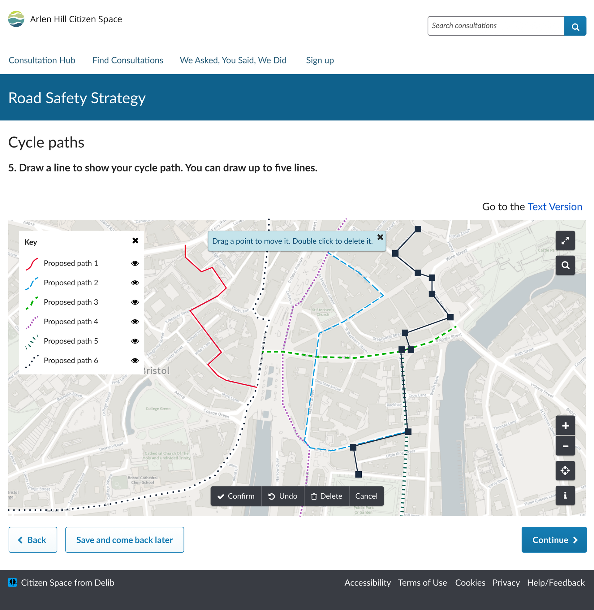

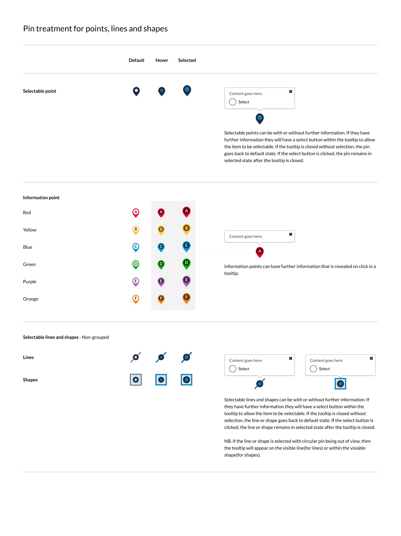
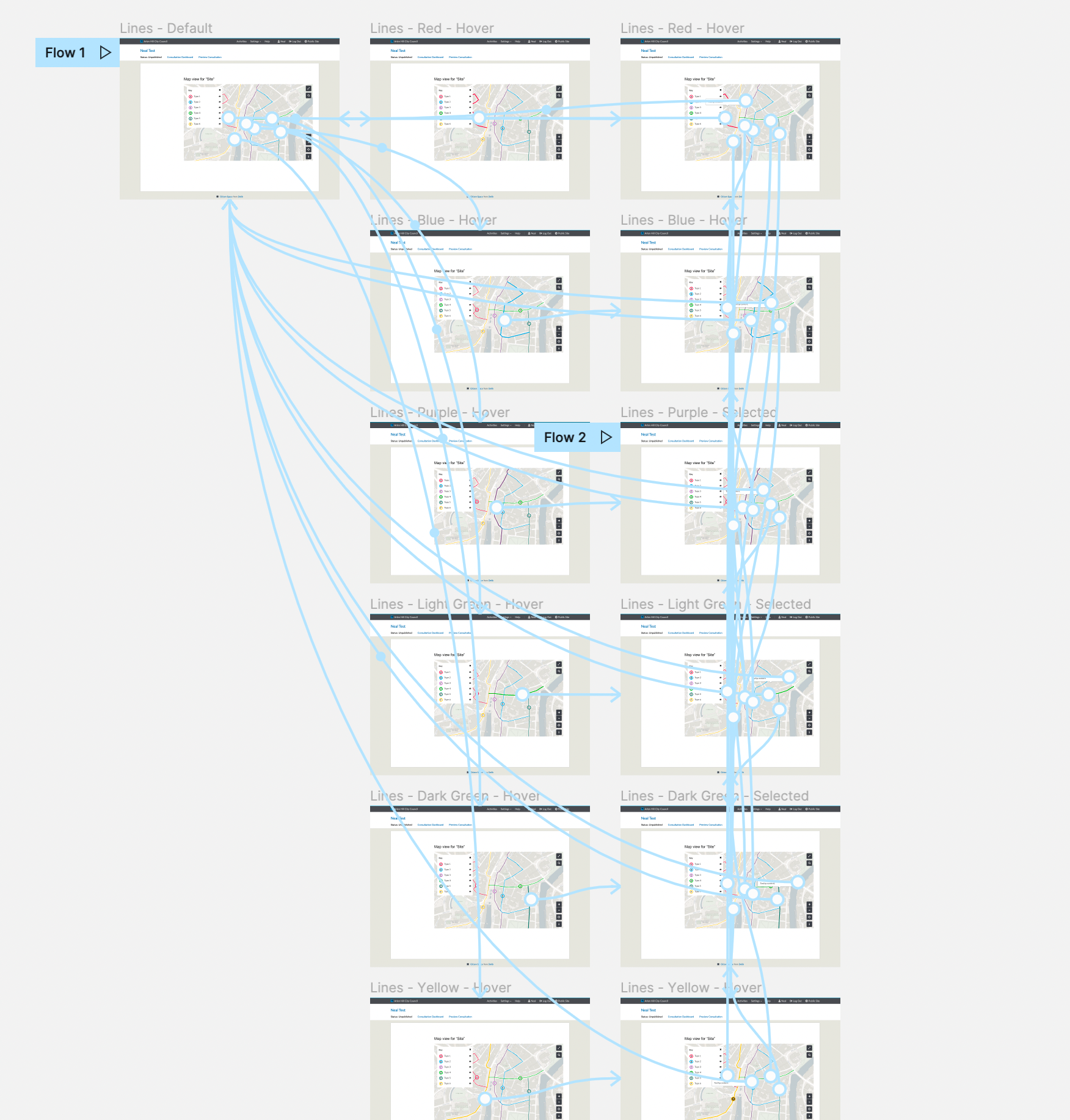
The main challenge with the interactive side of the maps was creating a clean, accessible UI that provided the user with feedback throughout their pin dropping and shape and line drawing process. We created lots of different iterations throughout the design process, prototyping at each stage to gather feedback and fine tune the map interactions.
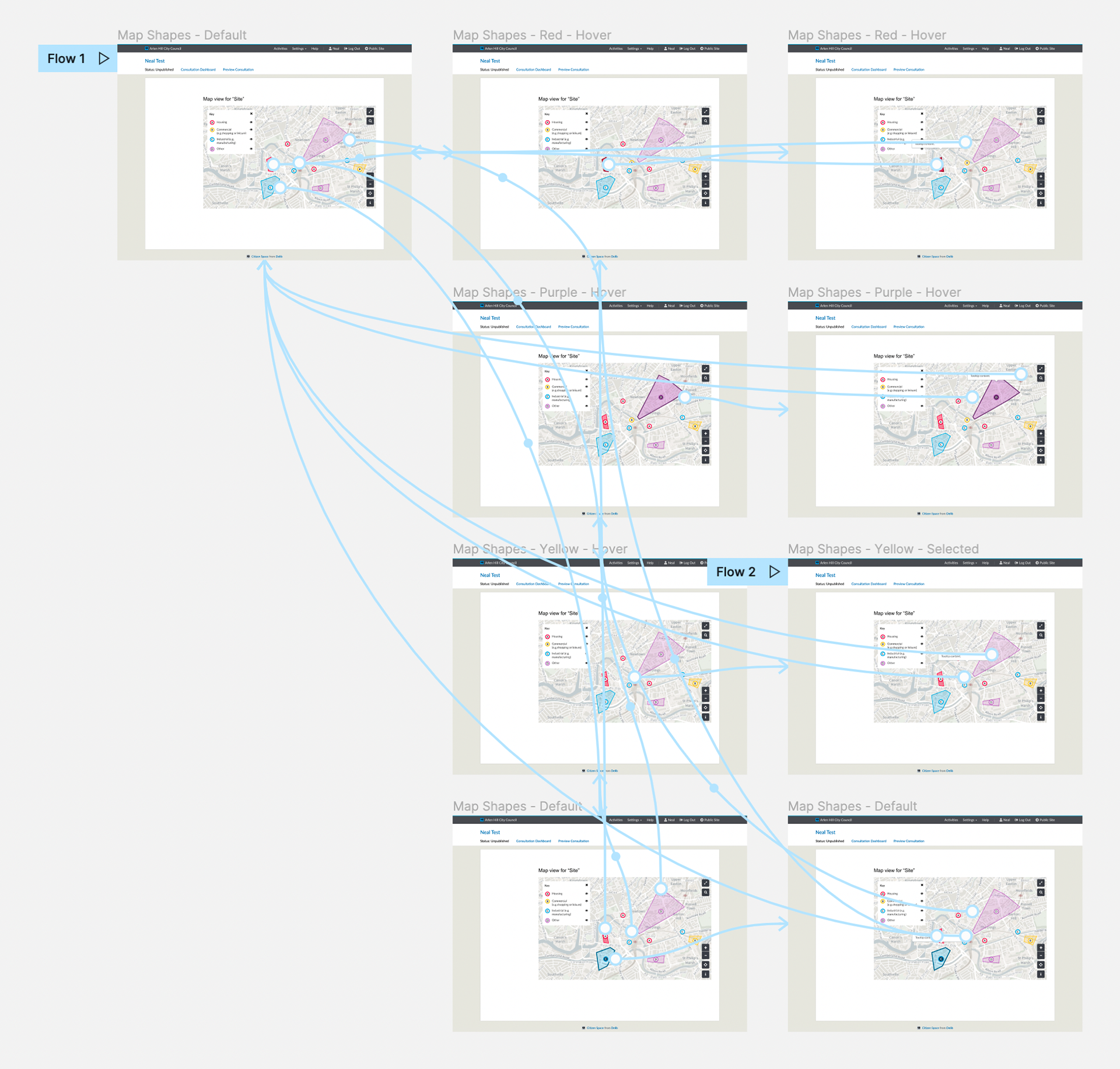
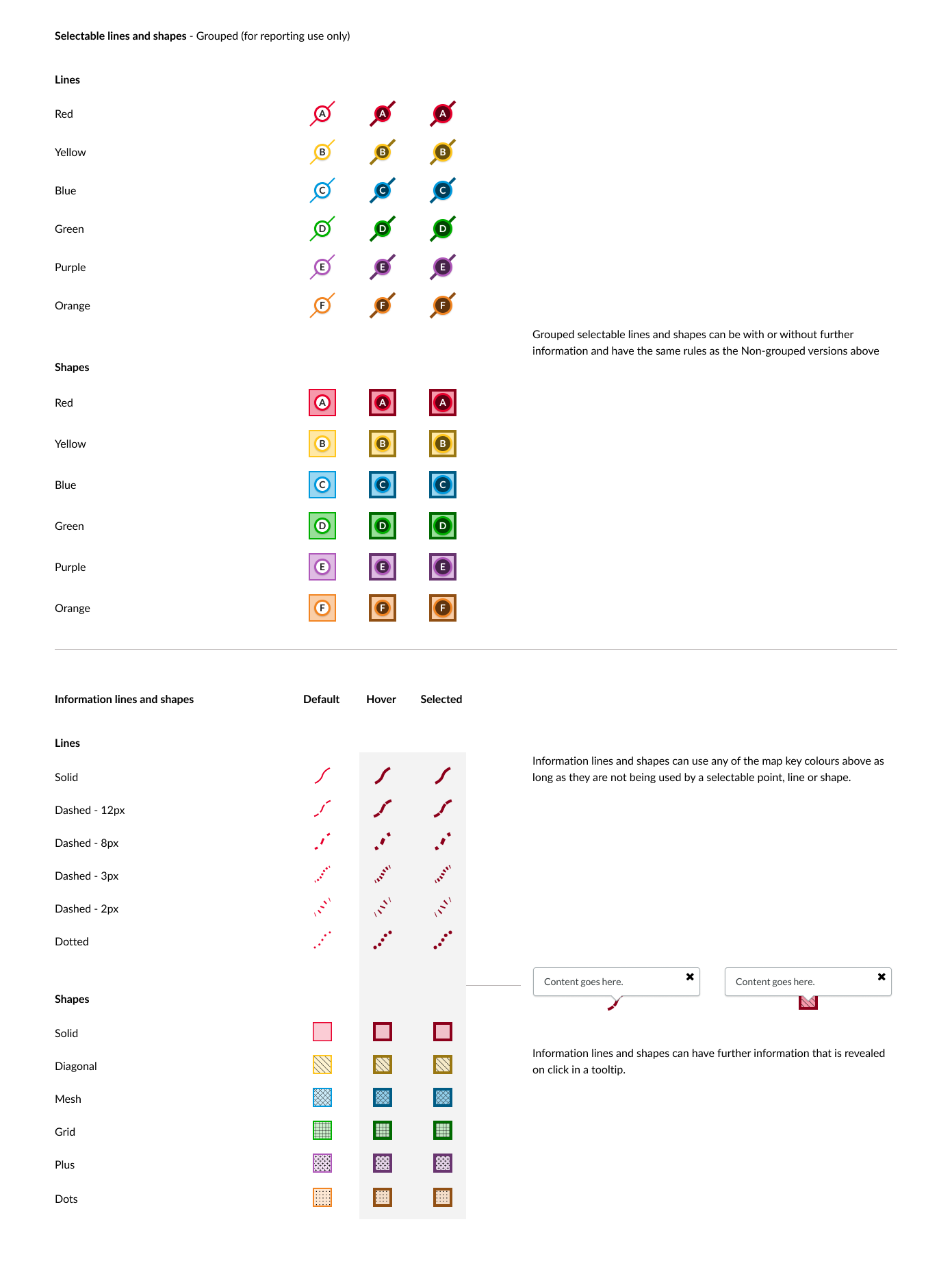
From an accessibility perspective, we made sure that all pins had the option of an alphabetical marker that was referenced in the map key. For lines and shapes we created a combination of dashed lines and patterns to differentiate them from each other so that they weren't purely dependant on colour as identifiers.
